7 types of stories to tell about your numbers and statistics

Storytelling can be as impactful even when telling stories about numbers and statistics. Here are 7 ways journalists use storytelling when talking about data.
Telling stories is part of any content creation process.
Stories create connections between your content and your audience. Your audience identifies better with stories, with your heroes, their difficulties, and how you can become the guide that helps them get to a happy ending.
But sometimes we have content to create about numbers. Statistics. Results.
Can these be stories?
Can these not be boring?
Yes they can.
Journalists have been doing it for a long time and have become very successful in doing it.
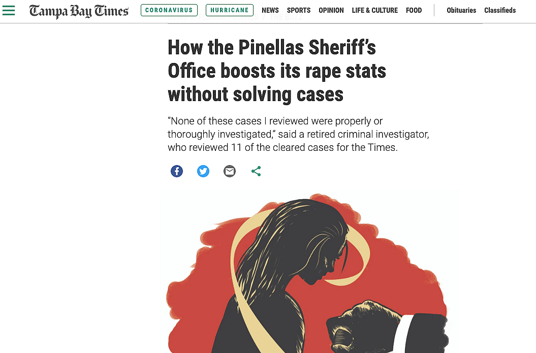
In an article published on the Online Journalism blog, Paul Graham outlined 7 common angles used by journalists when talking about numbers.
Depending on the data you have to create content for, some angles might be a very interesting way to create engaging content that will draw your audiences in.
The article gives great examples of each angle, but here they are, for reference:
- Scale — “This is how big a problem is”
- Change and stasis — things are going up, things are going down, things aren’t happening
- Ranking and outliers — who’s best and who’s worst? Who’s unusual and why?
- Variation — “postcode lotteries”, maps and distributions
- “Explore”: tools, interactivity — and art
- Relationships and debunking: when things are connected — or not
- Problems and solutions: bad data, “no data”, and “get the data” stories
How often do you have data and numbers stories to tell? What have you seen being the best angle to take? Which angle allows you to best explain numbers to your audience? We would love to hear from you about what has worked for you.


